Yana Skakun

Autumn Wedding Colour Palettes to Match the English Countryside
By Yana Skakun·10 July 2026·8 min read
Every couple planning an autumn wedding eventually asks some version of the same question: what colours actually work? It is a fair question, because autumn is unlike any other wedding season. The palette is already decided for you before you choose a single ribbon or flower — the hedgerows are turning rust, the fields are stubble-gold, the sky is doing that low, warm, slightly melancholy thing it only does between late September and mid-November. A good autumn wedding colour palette does not fight that backdrop. It works with it, picks up its tones, and lets the English countryside do half the styling for you.
I have photographed enough autumn weddings across Cambridgeshire and the wider East of England to have strong opinions about what genuinely photographs well against this particular landscape, as opposed to what merely looks good on a Pinterest board shot in California light. UK autumn light is softer, greyer at the edges, and far more forgiving of rich, saturated colour than the golden, high-contrast light most colour palette inspiration is originally shot in. That difference matters enormously when you are choosing actual fabric swatches and flower varieties, not just a mood board.
Why Autumn Is the Most Forgiving Season for Colour
Summer weddings in England often lean towards pale, washed-out palettes — blush, sage, dusty blue — partly because bright midday sun flattens saturated colour and partly because pastels feel seasonally appropriate against green lawns and marquees. Autumn flips that logic entirely. The low, diffused light of October and November has far less contrast, which means it can carry much deeper, richer colours without them looking harsh or overwhelming in photographs. Burgundy, rust, forest green, deep plum, and burnt orange all read as warm and inviting in autumn light in a way they simply do not under a July sun.
This is genuinely useful information when you are choosing bridesmaid dresses, suit waistcoats, or table linens, because it means you have more room to be bold than you might think. A deep terracotta dress that would look almost aggressive against a bright green summer lawn looks completely at home against a stubble field or a beech avenue in October. The season gives you permission for colour that summer weddings, by comparison, tend to mute.
The Core Autumn Countryside Palette
If you want a palette that will photograph beautifully against almost any English countryside venue between late September and early November, start with three tonal families rather than three specific colours. First, the warm rusts — terracotta, burnt orange, copper, amber. Second, the deep jewel tones — burgundy, plum, wine, deep berry. Third, a grounding neutral or green — forest green, olive, sage, or a warm taupe. Choosing one or two shades from each family, rather than trying to match every element to a single Pantone swatch, is what gives an autumn palette depth instead of looking like a themed party.
A palette I see work particularly well time and again is burnt orange and rust paired with a deep forest green and a warm cream or ivory as the base. It reads as unmistakably autumnal without tipping into "Halloween" territory, which is a real risk once orange gets involved. Another reliable combination is burgundy and plum with dusty gold accents and sage green foliage — more romantic, slightly more formal, and it photographs exceptionally well in the low late-afternoon light that most October ceremonies end up happening in.
Where couples sometimes go wrong is choosing a palette that is entirely warm-toned with no cool or neutral anchor at all. A wedding that is orange, rust, and gold from flowers to dress to linens to signage can start to feel visually heavy in photographs, particularly indoors under warm venue lighting, which already pushes everything towards amber. Building in at least one cooler or more neutral element — sage green foliage, ivory linen, a dusty blue ribbon on the bouquet — gives the eye somewhere to rest and keeps the images from reading as uniformly orange.
Flowers That Actually Grow and Look Right in a UK Autumn
British florists working seasonally in autumn have a genuinely wonderful range to draw from, and choosing flowers that are actually in season locally rather than importing colour matches from abroad tends to produce a bouquet and arrangements that feel coherent with the setting. Dahlias are the obvious autumn hero — they come in almost every rust, burgundy, and burnt-orange shade imaginable and they hold up well through a long wedding day. Chrysanthemums, unfairly associated with funerals by some, are extraordinary in the right varieties and colours, particularly the spider and quill types in bronze and rust.
Amaranthus trails add movement and a deep wine colour that photographs beautifully against skin tones and white or ivory fabric. Scabious, particularly the darker "chocolate" varieties, brings texture and a near-black burgundy that grounds a bouquet without making it heavy. For foliage, copper beech, eucalyptus with autumn-toned dried accents, and trailing amber-toned ferns all add the textural, slightly wild look that suits a countryside barn or marquee wedding far better than tightly structured, uniform greenery.
Do not overlook what is genuinely growing wild at that time of year, either. Rosehips, teasels, wheat, and dried grasses cost little, are entirely seasonal, and give arrangements an unmistakably English hedgerow character that expensive imported flowers cannot replicate. Several of the loveliest autumn florals I have photographed have been half florist-grown dahlias and half foraged material from the venue's own grounds.
Planning an autumn wedding?
If you are choosing a palette and want to know how it will actually photograph against your specific venue — the light, the setting, the time of your ceremony — I am always happy to talk through it before you commit to swatches or flower orders. Getting an outside eye on how colours will read in photographs, rather than just in person, can save a lot of second-guessing later.
Get in touchDressing the Wedding Party for the Palette
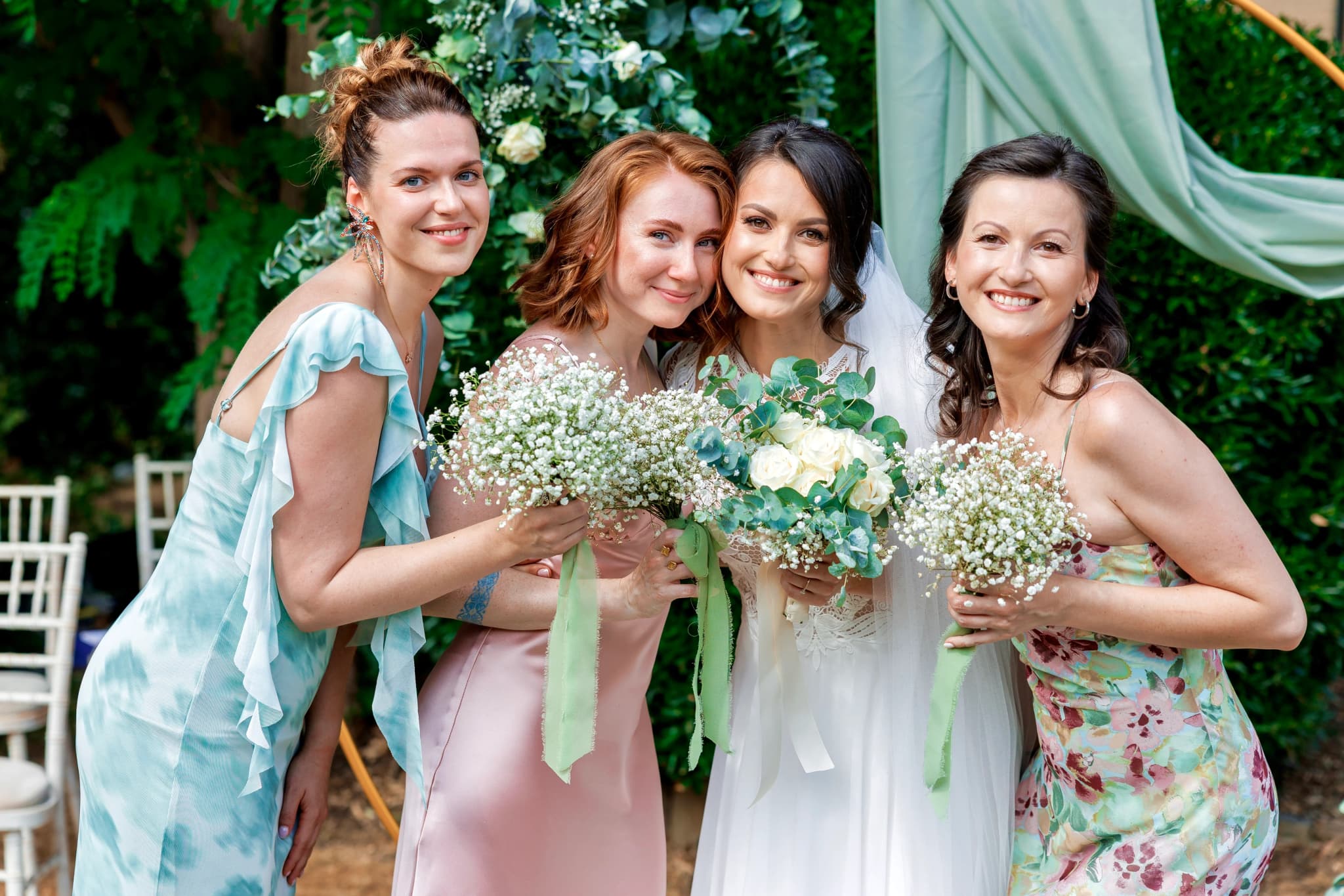
Bridesmaid and groomsman colours are where couples most often feel constrained, worrying that a strong autumn palette means asking their wedding party to wear something garish. In practice, the opposite is usually true. Deep, muted autumn tones tend to be more universally flattering across different skin tones than pale pastels, which can wash some complexions out. Burgundy, rust, forest green, and deep plum all sit at a saturation and depth that suits a wide range of people.
A practical approach that photographs well and gives bridesmaids room to choose a style that suits them is a mismatched palette within a defined tonal family — several different dress styles all in shades of rust, burgundy, and terracotta, for instance, rather than one identical dress in one identical colour. This has become common for good reason: it looks intentional and considered in photographs rather than uniform, and it lets each bridesmaid wear something that actually fits her body and her comfort.
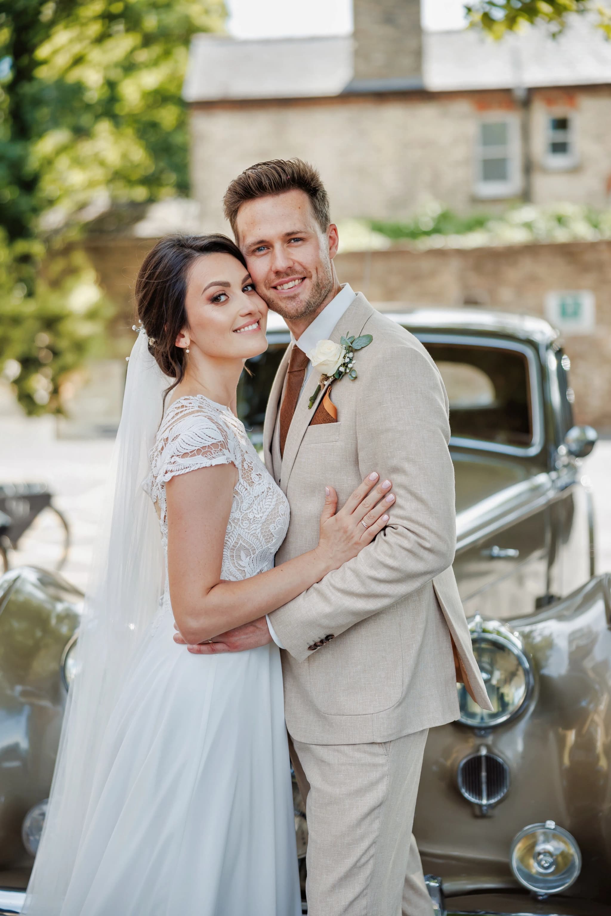
For groomsmen, a well-cut suit in deep green, navy, or a warm brown tweed works with almost any autumn palette, with the colour story carried through in the tie, waistcoat, or buttonhole rather than the suit itself. Tweed in particular has a natural affinity with the countryside setting many autumn UK weddings take place in, and it photographs with a texture that a plain suit simply does not have.
Venue Settings That Suit an Autumn Palette
The palette you choose should also respond to where you are getting married. A stone barn or converted farm building with exposed timber and warm interior tones will naturally harmonise with rust and burnt orange in a way that a bright white marquee or a grand Georgian hall might not. In those brighter, more formal settings, a slightly more restrained palette — deep burgundy and gold rather than full rust and orange — tends to look more considered against pale walls and formal architecture.
Cambridgeshire has a genuinely excellent range of venues for exactly this kind of autumn styling, from timber barns to walled gardens with mature trees that turn spectacular colours through October. If you are still choosing a venue and know you want an autumn wedding, it is worth visiting in person during the actual season the year before if you can, simply to see how the light and the surrounding colour actually behave rather than relying on photographs taken in high summer. Couples researching options across the region often start by browsing wedding photography across the UK to see how different settings and seasons come through in real images, which tends to be more useful than styled inspiration shoots.
Table Styling and the Details That Tie It Together
Table linen is where a lot of autumn palettes either come together or fall apart. A pure white tablecloth against rust and burgundy florals can look striking, but it can also look stark and slightly cold in photographs, especially under evening candlelight. A warm ivory, terracotta, or even a deep rust runner over a neutral cloth tends to photograph more cohesively, particularly once you add candlelight, which pushes everything towards amber regardless of the base colour you started with.
Candles are worth leaning into properly at an autumn wedding rather than treating as an afterthought. The evenings draw in early from late September onwards, and a reception that moves from daylight into a candlelit evening gets a genuinely beautiful transition in photographs if the styling has accounted for it — taper candles down the table length, pillar candles among the florals, and warm-toned fairy lights or festoon lighting overhead all reinforce the palette rather than competing with it.
Stationery, menus, and signage are a low-cost way to reinforce the palette without much additional expense. A deep rust or burgundy ink on cream card, or a simple wax seal in a colour that matches your flowers, does more visual work than people expect and shows up clearly in detail photographs, which are often some of the images couples value most when they see their full gallery.
How the Palette Photographs Through the Day
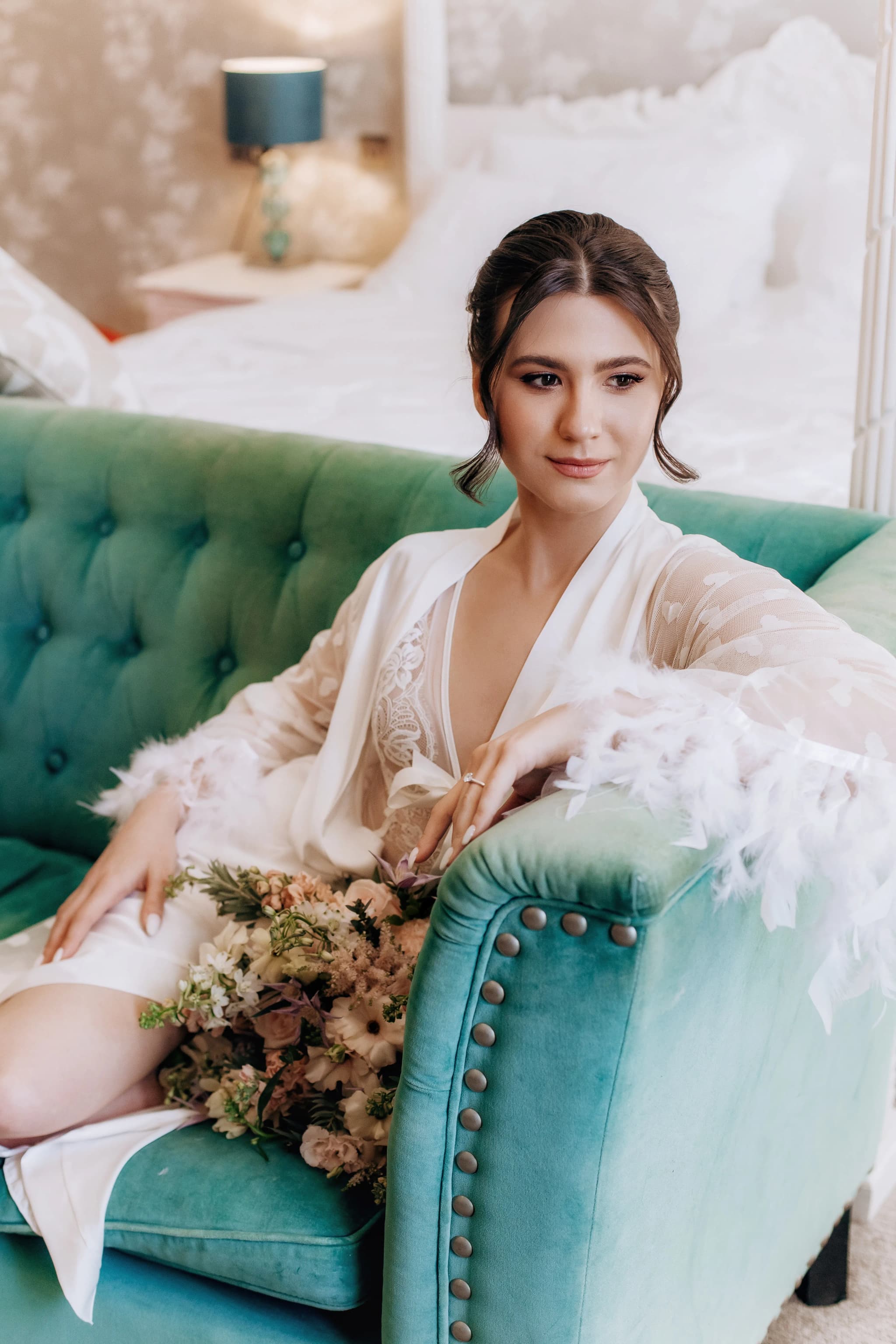
It is worth thinking about your palette across the whole day, not just the reception styling, because the light itself changes substantially between an autumn morning and an autumn evening. Getting-ready photographs in the late morning often have a soft, slightly cool quality, especially if it is an overcast day, which is common and genuinely beautiful for portraits — even, flattering, with none of the harsh shadows summer sun creates. By the time of an afternoon ceremony, the light has usually warmed considerably, and by early evening, if your reception runs into November, you may be working with candlelight and string lights well before eight o'clock.
A palette built around rust, burgundy, and green holds up consistently across all of those lighting conditions, which is part of why it works so well for a full day of documentary coverage rather than a single styled hour. Couples planning their day timeline sometimes underestimate how much earlier sunset comes in October and November compared to a summer wedding, and building in enough time for portraits before the light goes matters more at this time of year than almost any other. If timing and coverage are things you are still working out, it is worth discussing directly rather than guessing — details like this are exactly what a proper planning conversation before booking is for, alongside working through packages and pricing so the day is planned around the light you actually want captured.
A Note for Couples Planning Something Smaller
Not every autumn wedding is a full sixty-person countryside affair, and the same colour logic applies just as well to an intimate day. Couples choosing an elopement or small ceremony in autumn often have even more freedom with colour, since there is no large wedding party to coordinate and dress in matching tones. A single bold burgundy or rust dress against a woodland or hillside backdrop, with no attempt to match anything else to it, can produce some of the most striking autumn wedding photographs precisely because the palette is simple: one strong colour against the landscape's own.
Whatever the scale of the day, the images end up living on for decades, in prints on a wall and eventually in an album that gets pulled out on anniversaries. It is worth choosing a palette you will still love the look of in photographs ten years from now, not just one that felt on-trend the season you got married — which is part of why I always encourage couples to think about their wedding album early, since seeing a full sequence of images printed together tends to clarify very quickly which colour choices actually held up.
Autumn gives English countryside weddings something no other season quite offers: a landscape that is already doing the styling work for you, in colours no florist or stylist could improve on. Choose a palette that leans into that rather than against it, and the photographs from your day will feel unmistakably of their season for as long as you keep them. If you are planning an autumn wedding and want to talk through how your colours, venue, and timeline will come together in photographs, get in touch — I would love to hear about your day. Yana Skakun Photography is based in Cambridge and works with couples across the East of England and beyond.
Yana Skakun
Photographer · England
Professional wedding, family and portrait photographer based in England. Passionate about capturing authentic emotions and timeless moments.
About Yana →autumn wedding color paletteautumn wedding colours UKcountryside wedding stylingautumn wedding flowersrust burgundy weddingCambridgeshire wedding photographer
Wedding Tips — Wedding Photography in Cambridge & England
Yana Skakun is a professional wedding photographer based in Cambridge, covering weddings across England — from intimate elopements to full-day ceremonies at country houses, barns, and city venues. Every couple receives a relaxed, documentary approach that captures the day as it truly unfolds. This guide — Autumn Wedding Colour Palettes to Match the English Countryside — is part of the photography journal: practical, experience-based advice drawn from real sessions across England. Whether you arrived searching for autumn wedding color palette or autumn wedding colours uk, the same care and attention shapes every session Yana photographs.
Wedding Photography sessions are available year-round, with bookings open across Cambridge, Ely, Huntingdon, Peterborough, and further afield — East England, London, the Midlands, and beyond. If you have specific questions about countryside wedding styling, mention it in your enquiry. Get in touch through the contact form above to check availability and discuss your session. Enquiries are welcomed from anywhere in the UK.
Frequently Asked Questions
How much does a wedding photographer cost in England?+
Wedding photography in England typically ranges from £1,500 to £4,000+ for a full day. Price depends on experience, coverage hours, and whether albums or engagement shoots are included. Most photographers charge between £2,000–£3,000 for 8–10 hours of coverage.
How early should you book a wedding photographer?+
For peak season (May–September), book 12–18 months in advance. For autumn and winter weddings, 9–12 months is usually sufficient. Popular photographers at popular venues fill up fast — as soon as you have a date and venue confirmed, start reaching out.
How many photos do you get from a wedding photographer?+
Most professional wedding photographers deliver 400–800 edited images for a full-day wedding. The exact number depends on coverage hours, how many guests there are, and the photographer's editing style. Quality matters more than quantity — a curated gallery of 500 images tells the story better than 1,500 unedited files.
Do you need a second photographer at your wedding?+
A second photographer is helpful if you want simultaneous coverage of getting-ready moments in different locations, multiple angles during the ceremony, or more candid coverage during the reception. It adds cost but significantly increases the variety and completeness of your gallery.
What is the difference between documentary and editorial wedding photography?+
Documentary (reportage) wedding photography captures moments as they happen — the photographer observes and doesn't intervene. Editorial photography involves deliberate direction: placing you in good light, shaping compositions, creating intentional portraits. Most photographers blend both styles throughout the day.
Continue Reading
Related Articles

Wedding Tips
Sustainable Eco-Friendly Wedding Guide — Planning a Green Celebration
15 min read · Read Article
Wedding Tips
Trash the Dress Session — Complete Planning and Photography Guide
14 min read · Read Article
Wedding Tips
Client Communication for Photographers — From Enquiry to Gallery Delivery
15 min read · Read Article
Get in Touch
Ready to Book Your Session?
Get in touch to discuss your vision — I'll reply within 24 hours.